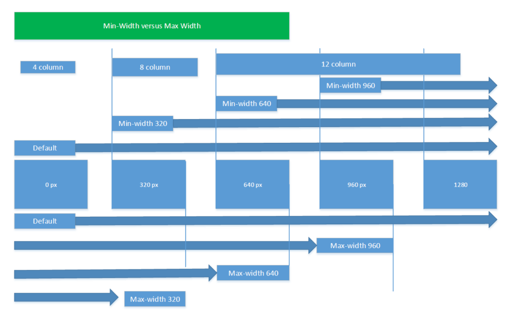
Max-Width: If device width is less than or equal to 800px, then do {…}
** Use sparingly **
Min-Width : If device width is greater than or equal to 800px, then do {…}
** Use as much as possible as Max will load more styles **
<style type="text/css">
    /* default styles here for older browsers.
       I tend to go for a 600px - 960px width max but using percentages
    */
    @media only screen and (min-width:960px){
        /* styles for browsers larger than 960px; */
    }
    @media only screen and (min-width:1440px){
        /* styles for browsers larger than 1440px; */
    }
    @media only screen and (min-width:2000px){
        /* for sumo sized (mac) screens */
    }
    @media only screen and (max-device-width:480px){
       /* styles for mobile browsers smaller than 480px; (iPhone) */
    }
    @media only screen and (device-width:768px){
       /* default iPad screens */
    }
    /* different techniques for iPad screening */
    @media only screen and (min-device-width: 481px) and (max-device-width: 1024px) and (orientation:portrait) {
      /* For portrait layouts only */
    }

    @media only screen and (min-device-width: 481px) and (max-device-width: 1024px) and (orientation:landscape) {
      /* For landscape layouts only */
    }
</style>
Credit :
- http://kevinwtharp.com/lessons/Dynamic_Web_Technologies/Implementing_a_Responsive_Design_using_CSS_Media_Queries.html
- https://stackoverflow.com/questions/13550541/media-min-width-max-width